Difference between revisions of "Stata Coding Practices: Visualization"
| (9 intermediate revisions by one other user not shown) | |||
| Line 57: | Line 57: | ||
graph draw , ysize(7) | graph draw , ysize(7) | ||
graph export "scatter.png" | graph export "scatter.png" , width(4000) | ||
</syntaxhighlight> | </syntaxhighlight> | ||
| Line 139: | Line 139: | ||
===The <syntaxhighlight lang="stata" inline>graph</syntaxhighlight> command=== | ===The <syntaxhighlight lang="stata" inline>graph</syntaxhighlight> command=== | ||
The <syntaxhighlight lang="stata" inline>graph</syntaxhighlight> command creates visualizations of one or more variables in the dataset. The <syntaxhighlight lang="stata" inline>graph</syntaxhighlight> command creates visualizations which have a Y-axis and a categorical axis. | The <syntaxhighlight lang="stata" inline>graph</syntaxhighlight> command creates visualizations of one or more variables in the dataset. The <syntaxhighlight lang="stata" inline>graph</syntaxhighlight> command creates visualizations which have a Y-axis and a categorical axis. The main strength of the <syntaxhighlight lang="stata" inline>graph</syntaxhighlight> command used in this way is that it uses the <syntaxhighlight lang="stata" inline>collapse</syntaxhighlight> syntax to rapidly calculate many possible statistics for any number of variables. The <syntaxhighlight lang="stata" inline>over()</syntaxhighlight> and <syntaxhighlight lang="stata" inline>by()</syntaxhighlight> options provide flexibility to do any desired subgrouping of the results. | ||
For example, we might write: | For example, we might write: | ||
<syntaxhighlight lang="stata"> | <syntaxhighlight lang="stata"> | ||
sysuse auto.dta, clear | |||
graph hbar /// | graph hbar /// | ||
(mean) price (median) price (max) length /// | (mean) price (median) price (max) length /// | ||
| Line 155: | Line 157: | ||
[[file:graph-hbar.png|4000px]] | [[file:graph-hbar.png|4000px]] | ||
The main shortcoming of this command is that it provides little customization of the actual display of the results, such as combining various statistics. For example, it cannot combine the <syntaxhighlight lang="stata" inline>(mean)</syntaxhighlight> and <syntaxhighlight lang="stata" inline>(sem)</syntaxhighlight> options in different styles such that a bar graph with confidence intervals would be produced. (You might try <syntaxhighlight lang="stata" inline>betterbar</syntaxhighlight>, available from SSC, for that.) Similarly, multiple variables with very different scales may not be possible to display in the same graphic easily, and numerical variables which have non-numerical interpretations - such as dates or labelled variables - may not be easily or correctly handled as intended without extensive manipulation. | |||
The <syntaxhighlight lang="stata" inline>graph</syntaxhighlight> command also provides a range of syntaxes for other graphing functions, such as drawing, saving, and exporting graphs. These are not described here and - other than these - most should rarely be used. | The <syntaxhighlight lang="stata" inline>graph</syntaxhighlight> command also provides a range of syntaxes for other graphing functions, such as drawing, saving, and exporting graphs. These are not described here and - other than these - most should rarely be used. | ||
===The <syntaxhighlight lang="stata" inline>twoway</syntaxhighlight> command=== | ===The <syntaxhighlight lang="stata" inline>twoway</syntaxhighlight> command=== | ||
The <syntaxhighlight lang="stata" inline>twoway</syntaxhighlight> command (often abbreviated <syntaxhighlight lang="stata" inline>tw</syntaxhighlight>) enables many of the same visualization approaches of the <syntaxhighlight lang="stata" inline>graph</syntaxhighlight> command. Unlike with <syntaxhighlight lang="stata" inline>graph</syntaxhighlight>, <syntaxhighlight lang="stata" inline>twoway</syntaxhighlight> creates an open-ended environment where multiple variables, various graphing styles, and several simultaneous axis environments can be combined. | |||
For example, we might write: | |||
<syntaxhighlight lang="stata"> | |||
sysuse auto.dta, clear | |||
tw /// | |||
(scatter weight length , mc(gray)) /// | |||
(lpoly weight length , lc(red)) /// | |||
(scatter weight length /// | |||
if rep78 == 2 /// | |||
, mlab(make) mlabsize(vsmall) mlabc(black) mc(black)) | |||
, yscale(r(0)) ylab(#6) | |||
</syntaxhighlight> | |||
[[file:tw-scatter.png]] | |||
The <syntaxhighlight lang="stata" inline>by()</syntaxhighlight> option can be used with <syntaxhighlight lang="stata" inline>twoway</syntaxhighlight>; the <syntaxhighlight lang="stata" inline>over()</syntaxhighlight> option cannot. | |||
<syntaxhighlight lang="stata"> | |||
sysuse auto.dta, clear | |||
tw /// | |||
(scatter weight length , mc(gray)) /// | |||
(lpoly weight length , lc(red)) /// | |||
(scatter weight length /// | |||
if rep78 == 2 /// | |||
, mlab(make) mlabsize(vsmall) mlabc(black) mc(black)) | |||
, yscale(r(0)) ylab(#6) /// | |||
by(foreign , legend(off)) | |||
</syntaxhighlight> | |||
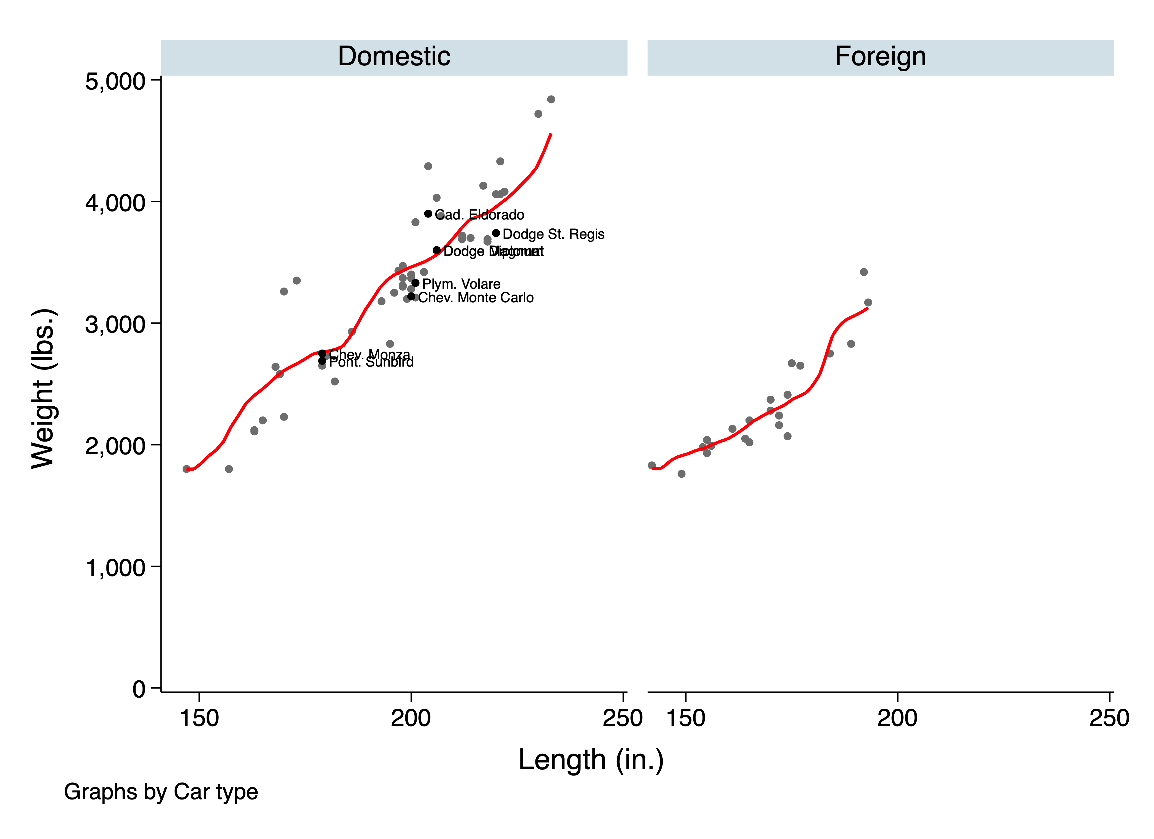
This yields: | |||
[[File:Tw-scatter-by.png]] | |||
Instead of using the <syntaxhighlight lang="stata" inline>over()</syntaxhighlight> option, code where multiple subsets of data are intended for the same graphing axes must be written explicitly. Usually this is not too complicated, unless there are a large or unknown number of groupings. In those cases, loops must typically be used to compensate for the loss of the <syntaxhighlight lang="stata" inline>over()</syntaxhighlight> option, in code like the following: | |||
<syntaxhighlight lang="stata"> | |||
sysuse auto.dta, clear | |||
levelsof foreign , local(levels) | |||
local colors = "red black" | |||
local counter 0 | |||
foreach level in `levels' { | |||
local ++counter | |||
local graphs = "`graphs'" /// | |||
+ " (scatter weight length if foreign == `level' " /// | |||
+ " , mc(`: word `counter' of `colors''))" /// | |||
+ " (lpoly weight length if foreign == `level' " /// | |||
+ " , lc(`: word `counter' of `colors''))" | |||
} | |||
tw `graphs' /// | |||
, legend(on pos(5) ring(0) c(1) /// | |||
order(0 "Origin:" 2 "Domestic" 4 "Foreign") ) /// | |||
yscale(r(0)) ylab(#6) /// | |||
xtit("Car Length (in.)") ytit("Car Weight (lbs.)") | |||
</syntaxhighlight> | |||
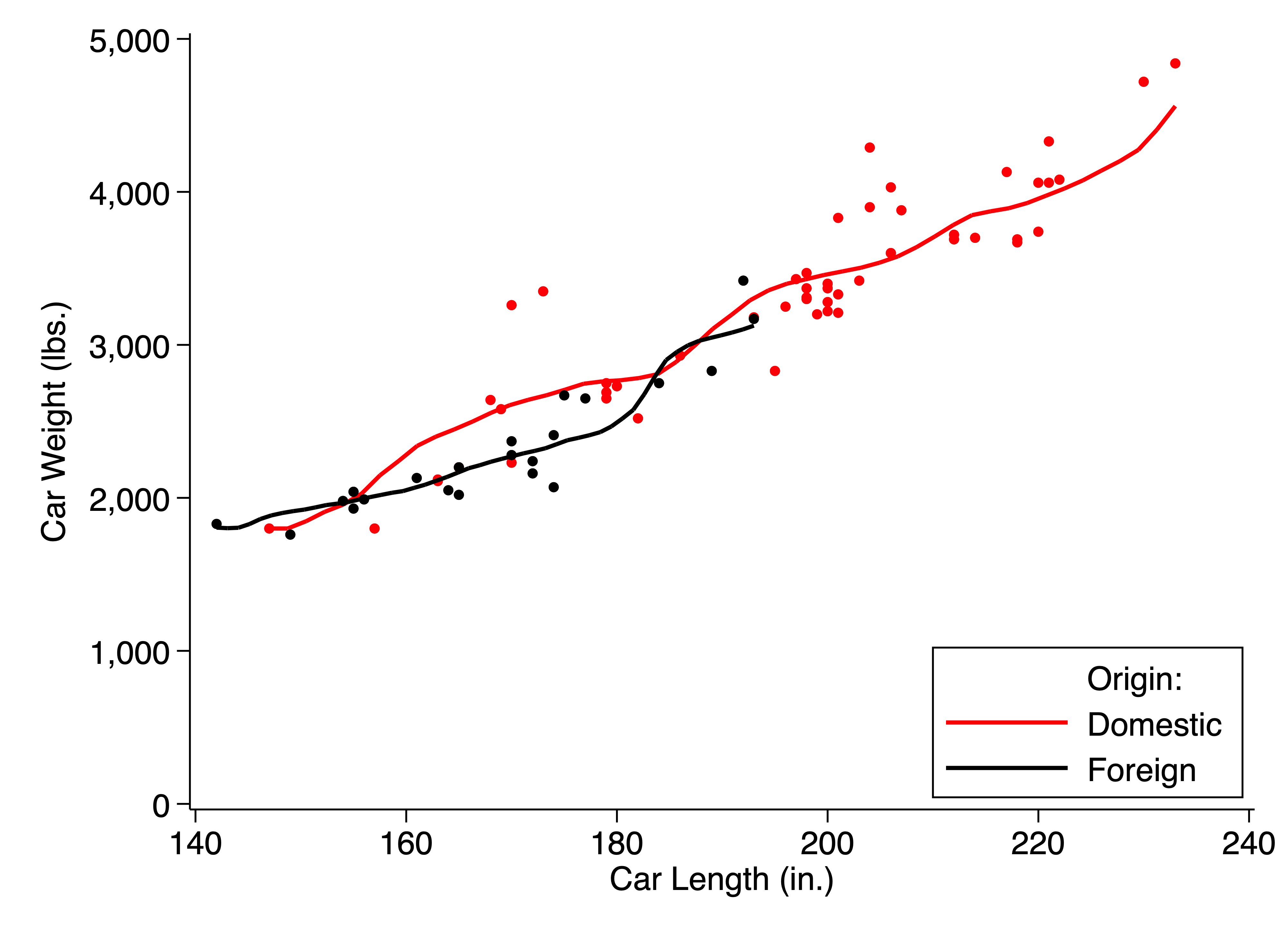
This code produces: | |||
[[file:tw-scatter-over.png]] | |||
===Built-in visualization commands=== | ===Built-in visualization commands=== | ||
There are a small number of built-in visualization commands which do not need to be called through the <syntaxhighlight lang="stata" inline>graph</syntaxhighlight> or <syntaxhighlight lang="stata" inline>twoway</syntaxhighlight> commands. The most common are: | |||
* <syntaxhighlight lang="stata" inline>histogram</syntaxhighlight> | |||
* <syntaxhighlight lang="stata" inline>lowess</syntaxhighlight> | |||
* <syntaxhighlight lang="stata" inline>lpoly</syntaxhighlight> | |||
* <syntaxhighlight lang="stata" inline>scatter</syntaxhighlight> | |||
* <syntaxhighlight lang="stata" inline>marginsplot</syntaxhighlight> | |||
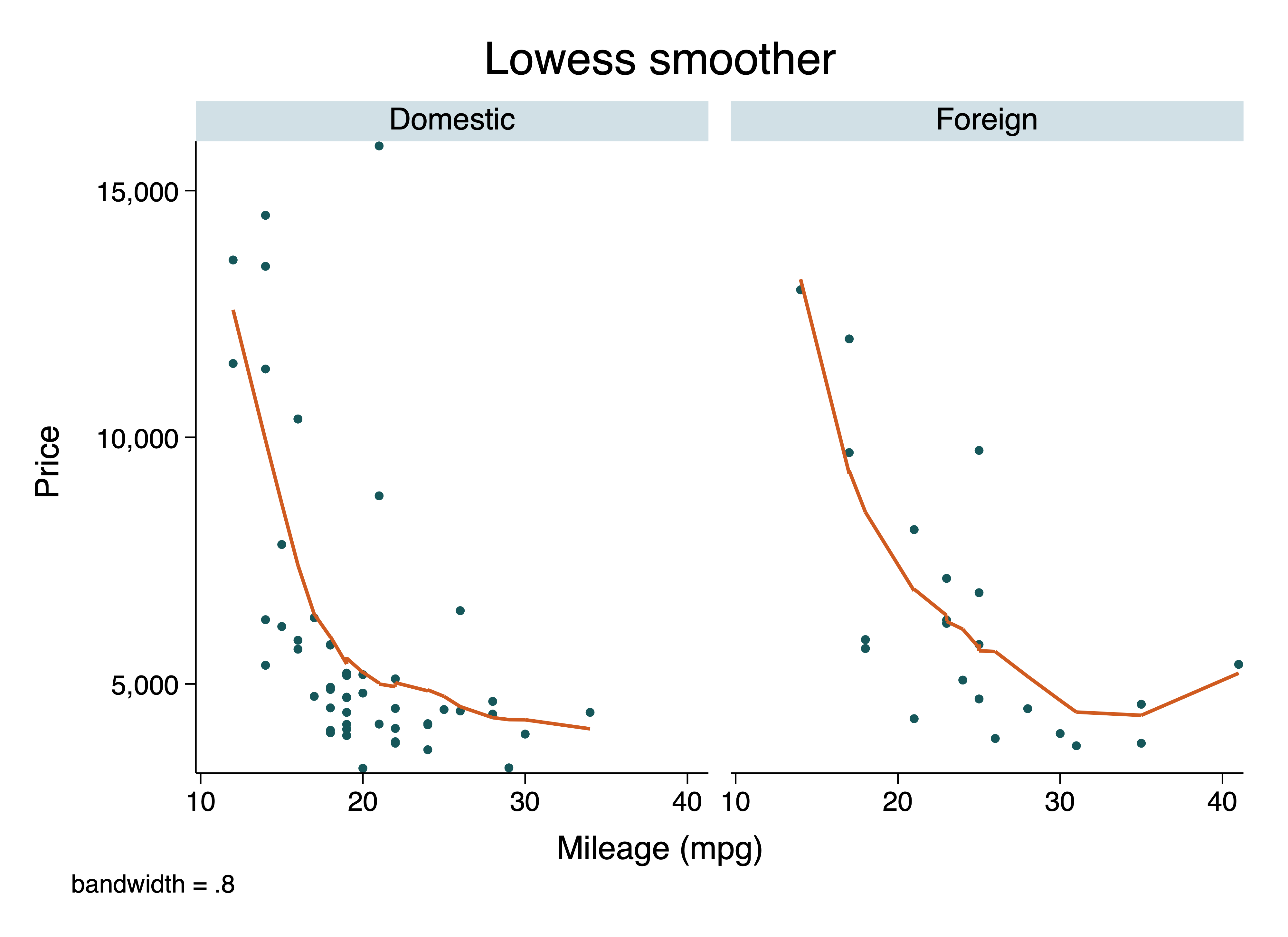
These can be called quickly to create simple graphs, such as using <syntaxhighlight lang="stata" inline>lowess price mpg, by(foreign)</syntaxhighlight> to create the following: | |||
[[file:lowess-by.png]] | |||
In general, however, these should be called within a <syntaxhighlight lang="stata" inline>twoway</syntaxhighlight> environment in most cases, because their behavior and options will change. For example, <syntaxhighlight lang="stata" inline>lpoly</syntaxhighlight> will not accept the <syntaxhighlight lang="stata" inline>by()</syntaxhighlight> option outside of <syntaxhighlight lang="stata" inline>twoway</syntaxhighlight>; and <syntaxhighlight lang="stata" inline>lowess</syntaxhighlight> will not create the scatterplot shown above inside a <syntaxhighlight lang="stata" inline>twoway</syntaxhighlight> environment. | |||
===User-written visualization commands=== | ===User-written visualization commands=== | ||
There are many user-written commands that produce visualizations as all or part of their functionality. These commands are usually purpose-built and cannot be combined with others through a <syntaxhighlight lang="stata" inline>twoway</syntaxhighlight> environment. Additionally, depending on how the command is written, they may or may not take graphical options in the usual way. User-written commands will often have some set of the following features: | |||
* They will not take any options. This is rare. | |||
* They will take any regular <syntaxhighlight lang="stata" inline>twoway</syntaxhighlight> options as regular options. This is typical when the command is graphing data but not doing much customizable preprocessing. | |||
* They will take any regular <syntaxhighlight lang="stata" inline>twoway</syntaxhighlight> options within a special option, usually called something like <syntaxhighlight lang="stata" inline>graphoptions()</syntaxhighlight>. This is typical when the primary options are passed to a more important part of the command, like a regression model, before visualizing the results of that command. | |||
* They will take plot-specific <syntaxhighlight lang="stata" inline>twoway</syntaxhighlight> options, in cases where multiple elements are combined and general options would not allow appropriate styling, such as combining scatter plots, CIs, and regression lines. These types of options will be specified in the command help file. | |||
* They will allow you to add arbitrary additional plots in the same environment using an option such as <syntaxhighlight lang="stata" inline>addplot()</syntaxhighlight>, which follows the <syntaxhighlight lang="stata" inline>marginsplot</syntaxhighlight> syntax. This is uncommon. | |||
[[Category: Coding Practices]] | |||
[[Category: Stata Coding Practices]] | |||
Latest revision as of 16:42, 14 April 2021
Modern Stata versions have extremely powerful graphics capabilities which allow the rapid creation of publication-quality graphics from almost any kind of tabular data. Although the default graphical commands and settings leave much to be desired, the customizability and interoperability of Stata's visualization tools mean that almost any imaginable output can be rendered using Stata's built-in graphics engine.
Read First
Stata graphics are typically created using one of four command types. Each has specific use cases, strengths, and weaknesses, and it is important to be familiar with the abilities and limitations of each when considering which to use to create a particular visualization. All four methods (except some user-written commands) use the same basic styling syntax discussed in this article.
- The
graphcommand suite creates pre-packaged visualizations, typically based on Stata's nativecollapsesyntax and statistics. - The
twowaysuite, which is the most commonly used tool, allows a flexible and open-ended approach to visualizing any amount of information in an abstract set of axes. - Built-in graphical commands (such as
lowess) offer pre-packaged visualizations that do not follow thegraphstyle. These commands are typically better used within atwowayenvironment and may behave differently when used independently. - User-written commands (such as
iegraphorspmap) create custom visualizations, but typically have unique purpose-built syntaxes and cannot be integrated in atwowayenvironment.
General Graphics Tools
Graphics options
There are an enormous number of options available for each specific type of graph in Stata, and we will not cover those here. When drawing a graph, refer to the specific help file for its command to understand the full range of specific options available. These typically include key elements like marker shapes and sizes; coloration of lines, markers, and fill elements; transparency and added text; and so on. All of these elements will allow you to create the exact visual components you want to display and there are a large number of resources on using graphical elements to efficiently convey information to readers. Therefore we do not cover these elements in this section.
However, some elements are common to all graphs and it is typically beneficial to standardize these components across all the graphs you create for a single piece of work. One workable setting that covers the main bases is the following code, which creates global macros called easily into all graphs. The specific settings here are not recommendations, but are for illustration purposes of common graphical elements. In particular, this code:
- Left-aligns the graph title
- Sets the background colors to white
- Turns off axis lines
- Rotates y-labels 90 degrees
- Left-aligns the x-axis title
- Removes coloration and bordering from the legend
These settings are implemented as follows:
// For -twoway- graphs
global graph_opts ///
  title(, justification(left) color(black) span pos(11)) ///
  graphregion(color(white)) ///
  xscale(noline) xtit(,placement(left) justification(left)) ///
  yscale(noline) ylab(,angle(0) nogrid) ///
  legend(region(lc(none) fc(none)))

// For -graph- graphs
global graph_opts_1 ///
  title(, justification(left) color(black) span pos(11)) ///
  graphregion(color(white)) ///
  yscale(noline) ylab(,angle(0) nogrid) ///
  legend(region(lc(none) fc(none)))
Two further primary settings will be desired when creating graphs for publication purposes: the file type of the exported image file and the aspect ratio (width-to-height) of the file. The aspect ratio is set using the ysize() or xsize() options, with integers as the arguments.
The choice of file type is also important. PNG images tend to be of reasonable quality and natively viewable on all operating systems as well as on web browsers when stored in places like GitHub and Zenodo. However, PNG images will typically be insufficient quality for print media; journals may prefer "lossless" TIFF or EPS images. These may not be natively viewable in your operating system. You should never use graph save to create .gph files unless you intend to combine graphs later. (Similarly, the saving() option is discouraged in all other uses.)
One way to implement these settings is with code like the following. Note the file type is explicit in the file path extension for the graph export command:
sysuse auto.dta , clear

scatter price mpg ///
  , nodraw ${graph_opts}

  graph draw , ysize(7)
  graph export "scatter.png" , width(4000)
Graphical schemes
Graphical schemes apply a large number of these options simultaneously, and in doing so they provide one of the highest degrees of cross-system consistency that is possible in creating graphs. Stata includes several built-in graphical schemes; the familiar "Stata blue" graphs are created using the s2color scheme.
The graph scheme can be changed using the set scheme command. Stata will use the sysdir path to search for matching graph schemes, so for example a third-party scheme file (like Uncluttered) might be included in the top-level directory of a repository and applied in the run file by writing:
sysdir set PERSONAL "${directory}/"
set scheme uncluttered
This directs Stata to search for scheme-uncluttered.scheme and apply it to all graphics created while Stata remains open. This is a simple scheme which incorporates many of the universally-applicable options above for all graphs, particularly region coloring and axis marking. As with any third-party scheme, you should read the documentation; notably, this scheme provides a specific color palette and turns off the legend by default.
One thing that schemes cannot do, apparently, is control the default graphics font. This can be done using graph set, as in graph set window fontface "Helvetica".
Combining Stata graphics
Combining multiple graphs into a single image is an excellent way to present various elects of a single analysis at the same time. Combining graphs is especially useful when facing constraints on the number of allowable exhibits, or when one or more graphical elements are very simple but important.
There are two main approaches to combing graphs: overlaying multiple pieces of information on the same set of axes, or combining multiple visualizations into a single image with multiple panels (either aligned or not, although Stata handles alignment somewhat poorly).
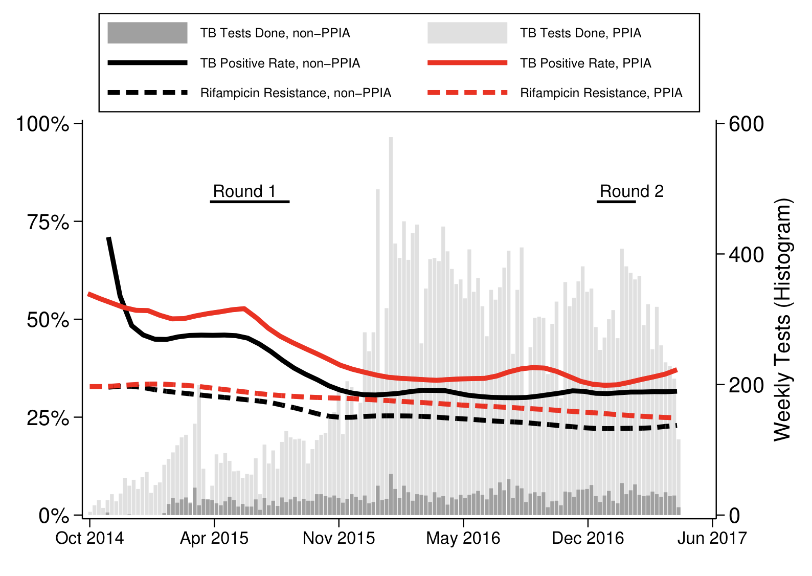
Overlaying graphics is accomplished using twoway syntax. In twoway, the graph axes are abstract, so with some abuse of notation it is possible to draw just about anything. Starting from the first axis, and proceeding in order of the commands written, Stata will layer graphs on top of each other on the same set of axes. Including a second (possibly invisible) axis allows further possibilities. For example, with the Uncluttered scheme applied and Helvetica set as the graph font, we might write the following twoway command:
  twoway ///
  /// Stacked histogram using total/subset approach
    (histogram date ///
      , freq yaxis(2) fc(gs14) ls(none) start(19997) width(7) barwidth(6) ) ///
    (histogram date if voucher_use == 0 ///
      , freq yaxis(2) fc(gs10) ls(none) start(19997) width(7) barwidth(6) ) ///
  /// Positivity
    (lpoly mtb date if voucher_use == 0 , lc(black) lw(thick) lp(solid)) ///
    (lpoly mtb date if voucher_use == 1 , lc(red) lw(thick) lp(solid)) ///
    (lpoly rifres date if voucher_use == 0 , lc(black) lw(thick) lp(dash)) ///
    (lpoly rifres date if voucher_use == 1 , lc(red) lw(thick) lp(dash)) ///
  /// Data collection
    (function 0.8 , lc(black) range(20193 20321)) ///
      (scatteri 0.8 20193 "Round 1" ,  mlabcolor(black) m(none) mlabpos(1)) ///
    (function 0.8 , lc(black) range(20814 20877)) ///
      (scatteri 0.8 20814 "Round 2" ,  mlabcolor(black) m(none) mlabpos(1)) ///
  /// Overall options
  , legend(on size(vsmall) pos(12) ///
      order( ///
        2 "TB Tests Done, non-PPIA" ///
        1 "TB Tests Done, PPIA" ///
        3 "TB Positive Rate, non-PPIA" ///
        4 "TB Positive Rate, PPIA" ///
        5 "Rifampicin Resistance, non-PPIA" ///
        6 "Rifampicin Resistance, PPIA" )) ///
    ${hist_opts} xoverhang ///
    ylab(${pct}) ytit("Weekly Tests (Histogram)", axis(2)) ///
    xtit(" ") xlab(,labsize(small) format(%tdMon_CCYY))
If we did, we would obtain something like:
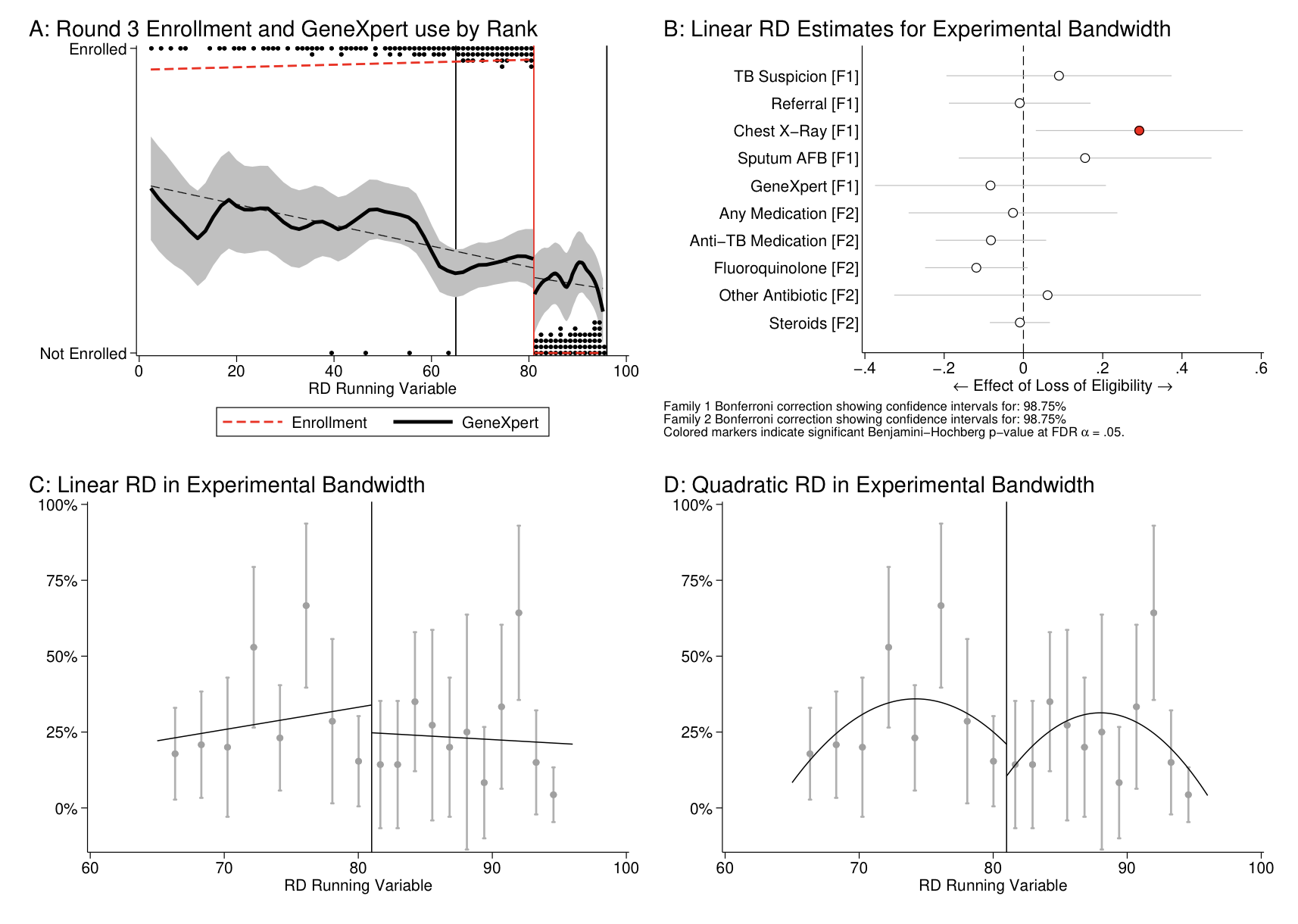
Alternatively, we might like to display information in panels that would not layer well together, or from commands which cannot be combined by twoway. For example, after creating some graphs with user-written commands (and including their panel titles), we might write:
  graph combine ///
    "${git}/outputs/f-discontinuity-1.gph" ///
    "${git}/outputs/f-discontinuity-2.gph" ///
    "${git}/outputs/f-discontinuity-3.gph" ///
    "${git}/outputs/f-discontinuity-4.gph" ///
    , altshrink
And we would obtain something like:
The graph combine command provides many options for customizing the layout and alignment of the graphs included. The user-written grc1leg command may also be useful when all of the visualizations included in the final image are intended to share a common legend. To save processing time when combining graphs, consider rendering the underlying graphs using the nodraw option, which saves graph rendering until the combined graph is drawn. Rendering the Graph window is computationally costly in Stata and is best avoided whenever possible.
Specific Visualization Approaches
The graph command
The graph command creates visualizations of one or more variables in the dataset. The graph command creates visualizations which have a Y-axis and a categorical axis. The main strength of the graph command used in this way is that it uses the collapse syntax to rapidly calculate many possible statistics for any number of variables. The over() and by() options provide flexibility to do any desired subgrouping of the results.
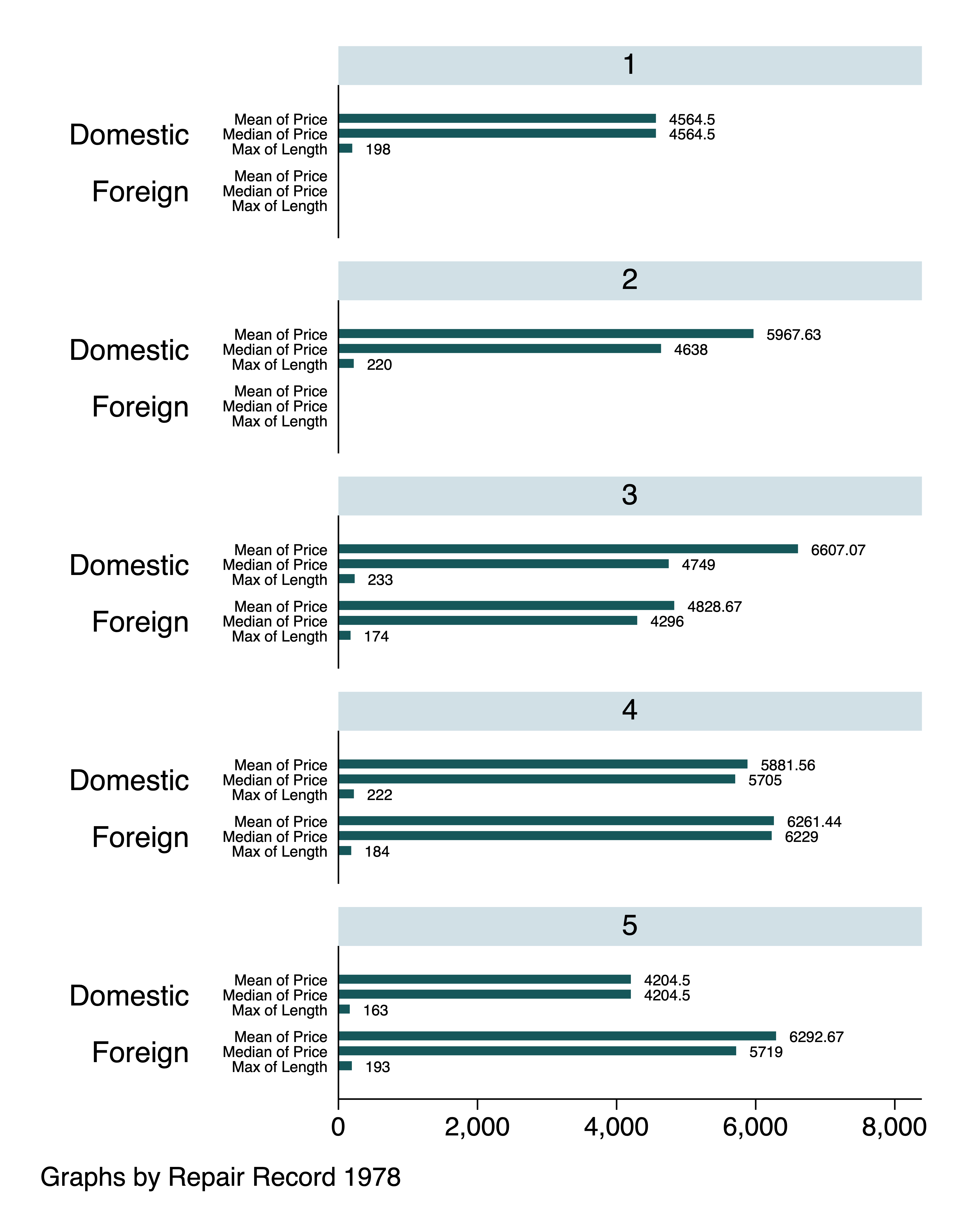
For example, we might write:
sysuse auto.dta, clear

graph hbar ///
  (mean) price (median) price (max) length ///
, asc yvaroptions( label(labsize(vsmall)) ///
    relabel(1 "Mean of Price" 2 "Median of Price" 3 "Max of Length") ) ///
  over(foreign) by(rep78 , c(1))  ///
  ysize(7) blabel(bar,size(vsmall))
And we would obtain:
The main shortcoming of this command is that it provides little customization of the actual display of the results, such as combining various statistics. For example, it cannot combine the (mean) and (sem) options in different styles such that a bar graph with confidence intervals would be produced. (You might try betterbar, available from SSC, for that.) Similarly, multiple variables with very different scales may not be possible to display in the same graphic easily, and numerical variables which have non-numerical interpretations - such as dates or labelled variables - may not be easily or correctly handled as intended without extensive manipulation.
The graph command also provides a range of syntaxes for other graphing functions, such as drawing, saving, and exporting graphs. These are not described here and - other than these - most should rarely be used.
The twoway command
The twoway command (often abbreviated tw) enables many of the same visualization approaches of the graph command. Unlike with graph, twoway creates an open-ended environment where multiple variables, various graphing styles, and several simultaneous axis environments can be combined.
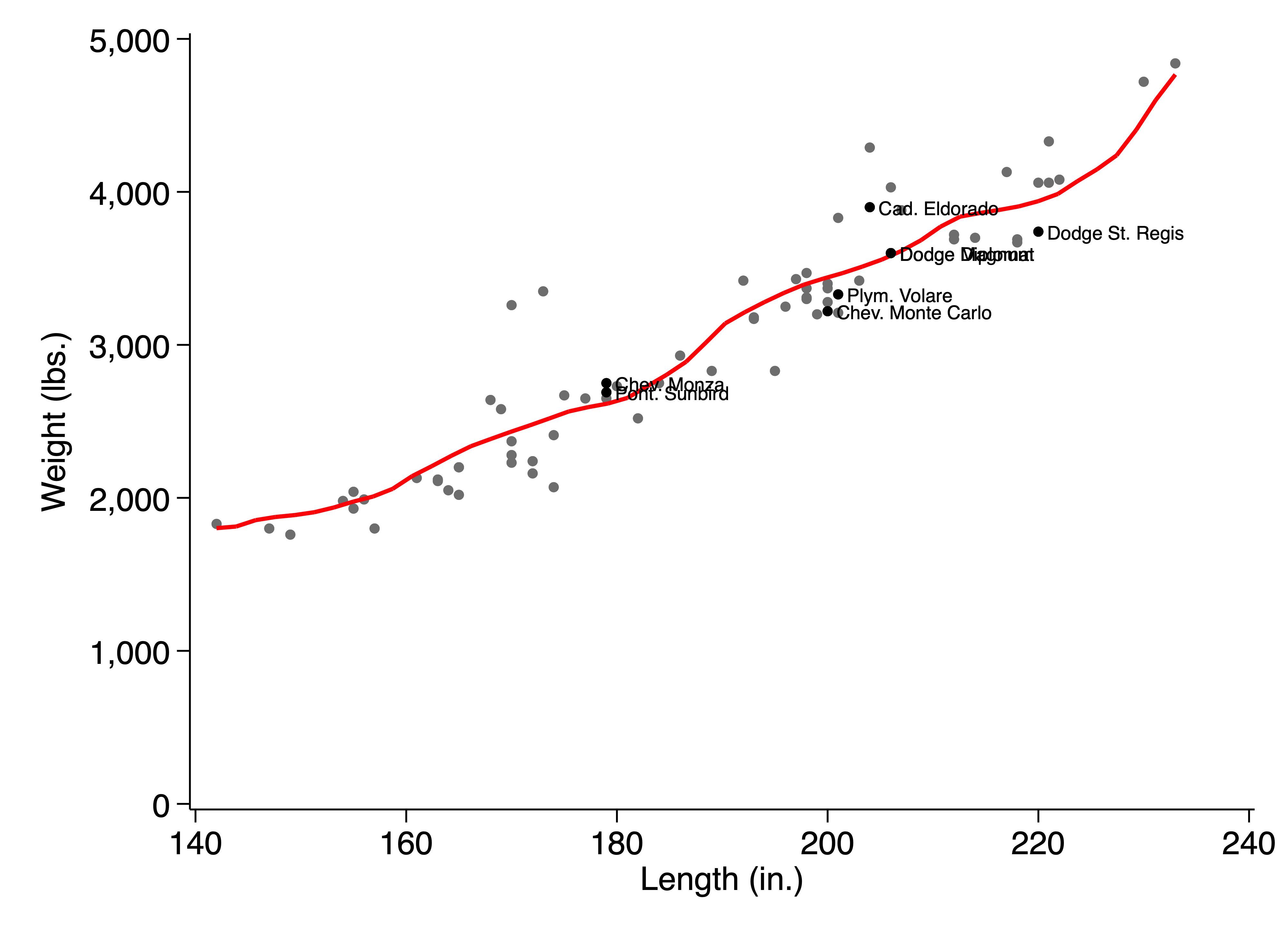
For example, we might write:
sysuse auto.dta, clear

tw ///
  (scatter weight length , mc(gray)) ///
  (lpoly weight length , lc(red)) ///
  (scatter weight length ///
    if rep78 == 2 ///
    , mlab(make) mlabsize(vsmall) mlabc(black) mc(black))
, yscale(r(0)) ylab(#6)
The by() option can be used with twoway; the over() option cannot.
sysuse auto.dta, clear

tw ///
  (scatter weight length , mc(gray)) ///
  (lpoly weight length , lc(red)) ///
  (scatter weight length ///
    if rep78 == 2 ///
    , mlab(make) mlabsize(vsmall) mlabc(black) mc(black))
, yscale(r(0)) ylab(#6) ///
  by(foreign , legend(off))
This yields:
Instead of using the over() option, code where multiple subsets of data are intended for the same graphing axes must be written explicitly. Usually this is not too complicated, unless there are a large or unknown number of groupings. In those cases, loops must typically be used to compensate for the loss of the over() option, in code like the following:
sysuse auto.dta, clear

levelsof foreign , local(levels)

local colors = "red black"

local counter 0
foreach level in `levels' {
  local ++counter
  local graphs = "`graphs'" ///
    + " (scatter weight length if foreign == `level' " ///
      + " , mc(`: word `counter' of `colors''))" ///
    + " (lpoly weight length if foreign == `level' " ///
      + " , lc(`: word `counter' of `colors''))"
}

tw `graphs' ///
, legend(on pos(5) ring(0) c(1) ///
    order(0 "Origin:" 2 "Domestic" 4 "Foreign") ) ///
  yscale(r(0)) ylab(#6) ///
  xtit("Car Length (in.)") ytit("Car Weight (lbs.)")
This code produces:
Built-in visualization commands
There are a small number of built-in visualization commands which do not need to be called through the graph or twoway commands. The most common are:
histogramlowesslpolyscattermarginsplot
These can be called quickly to create simple graphs, such as using lowess price mpg, by(foreign) to create the following:
In general, however, these should be called within a twoway environment in most cases, because their behavior and options will change. For example, lpoly will not accept the by() option outside of twoway; and lowess will not create the scatterplot shown above inside a twoway environment.
User-written visualization commands
There are many user-written commands that produce visualizations as all or part of their functionality. These commands are usually purpose-built and cannot be combined with others through a twoway environment. Additionally, depending on how the command is written, they may or may not take graphical options in the usual way. User-written commands will often have some set of the following features:
- They will not take any options. This is rare.
- They will take any regular
twowayoptions as regular options. This is typical when the command is graphing data but not doing much customizable preprocessing. - They will take any regular
twowayoptions within a special option, usually called something likegraphoptions(). This is typical when the primary options are passed to a more important part of the command, like a regression model, before visualizing the results of that command. - They will take plot-specific
twowayoptions, in cases where multiple elements are combined and general options would not allow appropriate styling, such as combining scatter plots, CIs, and regression lines. These types of options will be specified in the command help file. - They will allow you to add arbitrary additional plots in the same environment using an option such as
addplot(), which follows themarginsplotsyntax. This is uncommon.

