Data Flow Charts
The reason research projects go through the time-consuming and often costly effort it takes to acquire data is that in the end we want to analyze the data. The purpose of a data flow chart is to map out what datasets we need in order to create the datasets that we will run our analysis on, and to communicate to the full team how to create them. After the datasets are created, the data flow charts also becomes a great visual way of documenting how the analysis datasets were created.
Data flow charts are very much related to the data linkage table, and they should be created in an iterative process. Each starting point in the data flow chart should be a dataset listed in the data linkage table, but we often do not understand what the full list of datasets we need in the data linkage table is until we have created the data flow chart. Another way to compare the two tools is that the data linkage table is just list all the datasets we have or that we know we will have while the data flow chart maps out what datasets we need or will need, to create the datasets needed in our analysis.
It is common for projects to require more than one analysis dataset, for example when running regressions on multiple units-of-observations. In these cases, you need one data flow chart per analysis dataset.
Data flow charts can be very simple, for example, when your analysis dataset is created by appending the baseline data with the endline data. But even in a simple case like that, you often realize that there is some administrative data, treatment statuses, monitoring data, etc. that is also needed when writing the data flow chart. Mapping all those needs and documenting them well in both the data flow charts and the data linkage map is the best way to guarantee that you find yourself in a situation where you cannot construct the analysis data as you do not have all the datasets you need, or the datasets you have does not have the information needed to create the analysis dataset.
Example
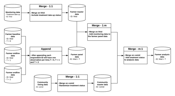
Below is a data flow chart of a project with three rounds of data collection on farmer level, where the treatment status was randomized on community level and treatment take up was monitored on farmer level. This example is based on the data linkage table above, and you can see that each starting point in the flow chart below corresponds to an item in the data linkage table.
In the example we have used the shape of a cylinder to represent a dataset and a rectangle to represent an action like “merge” or “append”. You do not need to follow this practice, but cylinders commonly indicate data in data infographics. The example below has been created in the free software https://www.lucidchart.com/, but could just as well be created in Microsoft PowerPoint. You could also do this on pen and paper or a whiteboard and scan or take a photo of the final version, but the benefit of creating the chart digitally is that it is easy to update if you have to change something over the course of the project. It is not a bad idea to create the first version on paper or on a whiteboard together with the rest of your project team, and then transfer it to an editable digital format.
For each dataset, we indicate in the data flow chart what the uniquely and fully identifying variable or variables are. Only ID variables that are listed as master project ID variables in the data linkage table should be used in the data flow chart. One common exception to that rule, however, is a variable indicating time in longitudinal data or other such “panel” structural indicators. Another best practice is to take note of the information from supporting datasets, such as treatment take-up in the monitoring data, that is the most relevant for the analysis data.
When a rectangle indicates that two dataset are combined with a merge, then the box indicates which ID will be used and if there is a one-to-one (1:1) merge, a one-to-many (1:m) merge or a many-to-one (m:1) merge. When a rectangle indicates that two datasets should be combined by appending them, then it is useful to indicate how the ID variable in the resulting data will have changed if it has changed.

