Difference between revisions of "Data Flow Charts"
| (4 intermediate revisions by the same user not shown) | |||
| Line 11: | Line 11: | ||
== Overview == | == Overview == | ||
Data flow charts are very much related to the [[Data Linkage Table|data linkage table]]. Together, the two form an interdependent loop. For instance, each starting point in the data flow chart should be a [[Master Dataset|dataset]] which is listed in the '''data linkage table'''. However, until we have created the data flow chart, we cannot easily understand which '''datasets''' we need to include in the '''data linkage table'''. An easy way to differentiate the two concepts is as follows - while the '''data linkage table''' just lists all the '''datasets''' we have, the data flow chart maps out which '''datasets''' we will need in order to create the '''datasets''' to perform [[Data Analysis|data analysis]]. | |||
'''Note''' - It is important to keep the following points in mind regarding | '''Note''' - It is important to keep the following points in mind regarding data flow charts: | ||
* | * Make one data flow chart for every '''analysis dataset'''. It is common for projects to require more than one '''analysis dataset''', for example when running regressions on multiple [[Unit of Observation|units of observation]]. In these cases, the [[Impact Evaluation Team|research team]] should make one data flow chart for each '''analysis dataset'''. | ||
* | * [[Data Documentation|Document]] your needs properly. Data flow charts can be very simple, for example, when the '''analysis dataset''' is created by appending the baseline data with the endline data. Even in such a case, the '''research team''' will need to include information about [[Administrative and Monitoring DataData|administrative data]], [[Randomized_Evaluations:_Principles_of_Study_Design#Step_2:_Randomization|treatment statuses]], [[Administrative_and_Monitoring_Data#Monitoring_Data|monitoring data]] etc. Mapping this information, and '''documenting''' it properly using data flow charts and the '''data linkage table''' is the best way to avoid a situation where the '''research team''' cannot construct the '''analysis dataset''' because they do not have all the '''datasets''' they need, or the '''datasets''' do not have all of the information that is required to create the '''analysis dataset'''. | ||
== Sample Data Flow Chart == | == Sample Data Flow Chart == | ||
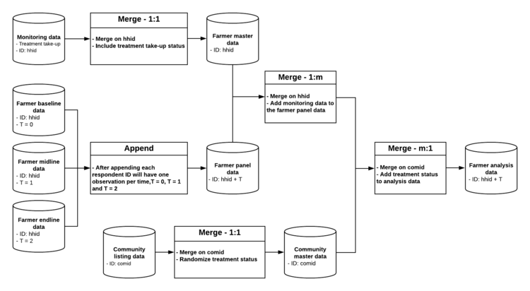
Given below is an example of a | Given below is an example of a data flow chart for a project that has three rounds of [[Primary Data Collection|data collection]]. The [[Unit of Observation|unit of observation]] for this example is the farmer, where the [[Randomized_Evaluations:_Principles_of_Study_Design#Step_2:_Randomization|treatment status]] was [[Randomization|randomized]] at the community level, and '''treatment''' take-up was monitored at the farmer level. This example is based on the [[Data Linkage Table|data linkage table]] that is provided [[Data_Linkage_Table#Template|here]]. Note that that each starting point in the flow chart below corresponds to an item in the mentioned '''data linkage table'''. | ||
[[File:DataFlowChart.png|750px|thumb|center|'''Fig. : Sample Data Flow Chart]] | [[File:DataFlowChart.png|750px|thumb|center|'''Fig. : Sample Data Flow Chart]] | ||
== Explanation == | == Explanation == | ||
Given below is an explanation of the thinking behind designing an effective | Given below is an explanation of the thinking behind designing an effective data flow chart: | ||
* | |||
* | * Cylinder => dataset; rectangle => action: in the above example of a data flow chart, we have used the shape of a cylinder to represent a [[Master Dataset|dataset]] and a rectangle to represent an action like merge or append. You do not need to follow this practice, but cylinders are commonly indicate '''datasets''' while creating such infographics. | ||
* | |||
* ''' | * Paper version versus digital version: this flow chart has been created using the open-source software [https://www.lucidchart.com/ Lucidchart], but this could just as well be created in Microsoft PowerPoint. Alternatively, you could also do this in pen and paper, or on a whiteboard, and then scan or take a photo of the final version. However, the benefit of creating the chart digitally is that it is easy to update if you have to change something over the course of the project. It is a good practice to create the first version on paper or on a whiteboard with the rest of your [[Impact Evaluation Team|research team]], and then transfer it to an editable digital format. | ||
* | |||
* | * Unique and fully-identifying [[ID Variable Properties|ID variables]]: for each '''dataset''', we have indicated in the data flow chart what the [[ID_Variable_Properties#Property_1:_Uniquely_Identifying|uniquely]] and [[ID_Variable_Properties#Property_2:_Fully_Identifying|fully identifying variable(s)]] are. | ||
*Master project '''ID variables''': make sure that you include only those '''ID variables''' in the data flow chart that are listed as master project '''ID variables''' in the [[Data Linkage Table|data linkage table]]. One common exception to this rule, however, is a '''variable''' indicating time in longitudinal data, or other similar panel structure indicators. | |||
* Supporting datasets: another best practice is to take note of the information from supporting '''datasets''', for instance, '''treatment''' take-up in the [[Administrative and Monitoring Data#Monitoring Data|monitoring dataset]] which is the most relevant for the [[Data Analysis|analysis]] '''dataset'''. | |||
*Other best practices: also note that when a rectangle indicates that two '''datasets''' are combined with a merge, then the box indicates which '''ID variable''' will be used, and whether the type of merge is a one-to-one (1:1) merge, a one-to-many (1:m) merge or a many-to-one (m:1) merge. When a rectangle indicates that two '''datasets''' should be combined by appending them, then it is useful to indicate how the '''ID variable''' in the resulting data will change if the appended '''datasets''' change. | |||
== Related Pages == | |||
[[Special:WhatLinksHere/Data_Flow_Charts|Click here to see pages that link to this topic]]. | |||
== Additional Resources == | == Additional Resources == | ||
*DIME Analytics (World Bank), [https://osf.io/dfu6a Data Map] | *DIME Analytics (World Bank), [https://osf.io/dfu6a Data Map] | ||
*DIME Analytics (World Bank), [https://osf.io/ptj3z Establishing a Measurement Framework] | *DIME Analytics (World Bank), [https://osf.io/ptj3z Establishing a Measurement Framework] | ||
Latest revision as of 20:34, 14 August 2023
A data flow chart is the third component of using a data map to organize data work within a research team. After collecting primary data, the end goal, after many intermediate steps, is to analyze it. Data flow charts allow the research team to visualize which datasets are needed in order to create the datasets that will finally be used for the analysis. They are also a useful tool to communicate to the rest of the team, and document how the analysis datasets are created using various intermediate datasets.
Read First
- A data map is a template designed by DIME Analytics to organize 3 main aspects of data work:
- The data map template consists of three components: a data linkage table, a master dataset, and data flow charts.
- Data flow charts specify which datasets are needed to create the analysis dataset and how they may be combined by either appending or merging datasets.
- Every original dataset that is mentioned in a data flow chart should be listed in the data linkage table.
Overview
Data flow charts are very much related to the data linkage table. Together, the two form an interdependent loop. For instance, each starting point in the data flow chart should be a dataset which is listed in the data linkage table. However, until we have created the data flow chart, we cannot easily understand which datasets we need to include in the data linkage table. An easy way to differentiate the two concepts is as follows - while the data linkage table just lists all the datasets we have, the data flow chart maps out which datasets we will need in order to create the datasets to perform data analysis.
Note - It is important to keep the following points in mind regarding data flow charts:
- Make one data flow chart for every analysis dataset. It is common for projects to require more than one analysis dataset, for example when running regressions on multiple units of observation. In these cases, the research team should make one data flow chart for each analysis dataset.
- Document your needs properly. Data flow charts can be very simple, for example, when the analysis dataset is created by appending the baseline data with the endline data. Even in such a case, the research team will need to include information about administrative data, treatment statuses, monitoring data etc. Mapping this information, and documenting it properly using data flow charts and the data linkage table is the best way to avoid a situation where the research team cannot construct the analysis dataset because they do not have all the datasets they need, or the datasets do not have all of the information that is required to create the analysis dataset.
Sample Data Flow Chart
Given below is an example of a data flow chart for a project that has three rounds of data collection. The unit of observation for this example is the farmer, where the treatment status was randomized at the community level, and treatment take-up was monitored at the farmer level. This example is based on the data linkage table that is provided here. Note that that each starting point in the flow chart below corresponds to an item in the mentioned data linkage table.
Explanation
Given below is an explanation of the thinking behind designing an effective data flow chart:
- Cylinder => dataset; rectangle => action: in the above example of a data flow chart, we have used the shape of a cylinder to represent a dataset and a rectangle to represent an action like merge or append. You do not need to follow this practice, but cylinders are commonly indicate datasets while creating such infographics.
- Paper version versus digital version: this flow chart has been created using the open-source software Lucidchart, but this could just as well be created in Microsoft PowerPoint. Alternatively, you could also do this in pen and paper, or on a whiteboard, and then scan or take a photo of the final version. However, the benefit of creating the chart digitally is that it is easy to update if you have to change something over the course of the project. It is a good practice to create the first version on paper or on a whiteboard with the rest of your research team, and then transfer it to an editable digital format.
- Unique and fully-identifying ID variables: for each dataset, we have indicated in the data flow chart what the uniquely and fully identifying variable(s) are.
- Master project ID variables: make sure that you include only those ID variables in the data flow chart that are listed as master project ID variables in the data linkage table. One common exception to this rule, however, is a variable indicating time in longitudinal data, or other similar panel structure indicators.
- Supporting datasets: another best practice is to take note of the information from supporting datasets, for instance, treatment take-up in the monitoring dataset which is the most relevant for the analysis dataset.
- Other best practices: also note that when a rectangle indicates that two datasets are combined with a merge, then the box indicates which ID variable will be used, and whether the type of merge is a one-to-one (1:1) merge, a one-to-many (1:m) merge or a many-to-one (m:1) merge. When a rectangle indicates that two datasets should be combined by appending them, then it is useful to indicate how the ID variable in the resulting data will change if the appended datasets change.
Related Pages
Click here to see pages that link to this topic.
Additional Resources
- DIME Analytics (World Bank), Data Map
- DIME Analytics (World Bank), Establishing a Measurement Framework

